Wednesday, December 18, 2013

Krav Maga map for GIS Day


Here was my map that I presented for GIS Day in November! I researched the creator of Krav Maga and traced where he started, which was in Czechoslovakia where he began the art. He later moved to Israel to join the IDF where after he was released, he taught the technique to the soldiers. I geocoded the USA sites of IKMF which stands for International Krav Maga Federation, where they practice fighting the way Imi originally taught it. His students came from Israel, started in New York and it slowly dispersed from there. 
I researched this because I took the class last spring at Mason and really enjoyed it!  

Thursday, December 12, 2013

Final Project


Here's my final outcome for the Final Project, mapping (Legal) Moonshine Distilleries in 6 southern states. The only problem I encountered was the mason jars, I wanted to crop them through Photoshop but it took way to long to download so I resorted to making them myself.
The audience this map goes towards would be lovers of 'Mountain Dew', or people who want to visit a distillery who have never been before!

Friday, December 6, 2013

Option 2 Extra Credit; top 10 maps!

I thought Jon's Alpaca natural breaks map was really creative and stood out, I like that for the highest data set he put actual alpacas in the state!

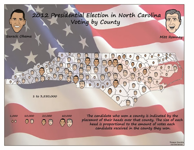
Tom's Bivariate map was very well done with how he actually cropped the heads of Romney and Obama! That can take a lot of time. He also stated at the bottom what the size of their heads mean related to them winning.

Nicole's dot density map for West Virginia was pretty cool with how she made a black background and the dots green, which made them really stand out. The clovers add a nice touch and her whole map looks balanced and neat!

Jared's Graduated symbol map for Maryland was really creative! I can tell it took him a lot of time to crop out the mountains or draw them and the background is awesome with the stream and the legend within it. 

John's map for his final project is awesome! I like the border of the Bigfoot's footprint, as well as the projection. It looks antiquey and just really creative.

Haley's was a good map for the weekly blog post measuring Dot density of global shipping. I liked how the data is different and the dots are in the ocean rather than on land!

Jame's weekly blog post of isolines was interesting to look at since the isolines are measuring the Earth's crust! Normally when seeing isolines they're measuring temperature so this was something different.

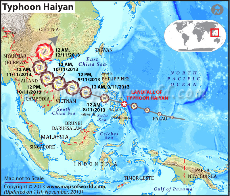
Gardy's weekly post about the Typhoon Haiyan was cool because it shows just how big the cyclone was compared to the islands it hit.

Danielle's post of skin color in the world by country was very interesting! I've never seen this done before and though it was neat to look at, although it's not very accurate..

Daniel's map of the African continent showing elephant population was cool because it shows that there is a great deal of them in South Africa but the farther north there are less.


Option 1 Extra Credit

A handy illustrator technique that I use that saves a lot of time is to hold down shift to select states or items on the map; that is especially useful for making choropleth maps.  I found that when I did this to put the different colors in the states, i could select the states that I wanted that would be all the same color, hold down shift and fill them in with that color. Great step for making life a little easier using Illustrator!  


Thursday, November 14, 2013

Typhoon Haiyan


This map was well done tracking the path of the Typhoon that recently plowed through the Philippines. Not only does it show the impact of the typhoon and track the times, but it shows elevation of the surrounding waters, most important being the North Pacific Ocean where it originated. It also has great labeling so that the average person who isn't too familiar with the Eastern World can easily identify what is what.

Source: http://www.mapsofworld.com/world-news/super-typhoon-haiyan/

Tuesday, November 12, 2013

Example of a Bivariate Map


I thought that this map was done well with how they proportioned their symbols with the choropleth map. The houses have a nice transparency so can see the color of the data clearly through the symbols.